

What is the significance of having a mobile SEO strategy for your business when laptops and PCs are still prevalent? In 2021, the average American spent 161 minutes daily on a mobile device.
According to Statista’s report, over half of all website traffic worldwide (52.2%) comes from mobile devices, which can translate to more sales opportunities.
Taking advantage of the mobile SEO revolution can help increase your online visibility and provide multiple chances to convert your site visitors into customers organically.
However, keeping up with the ever-changing algorithms and growing techniques in global platforms for mobile SEO in digital marketing can be complex and overwhelming. Hence, we’ll share the best SEO practices for mobile to help you deliver a seamless web experience to potential customers by 2023.
Get a free user experience design analysis
Why Does Mobile SEO Matter for Your Brand?
SEO plays a crucial role in boosting website rankings and visibility, with mobile-friendliness being an essential aspect of it.
A mobile-friendly website is crucial to enhance brand perception and search engine rankings.
You May Also Like: How To Post An SEO Friendly Blog?
Below are some reasons why prioritizing mobile SEO is crucial for your brand:
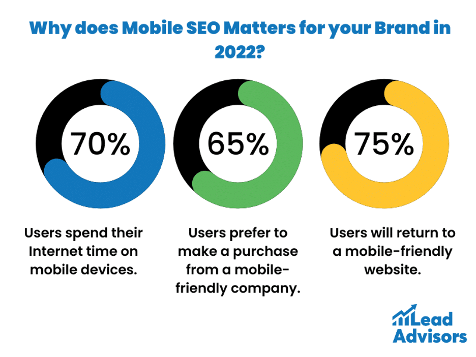
- Users spend over 70% of their Internet time on mobile devices.
- By 2023 B2B Buyer’s Survey found that 67% of B2B buyers start buying with a broad web search.
- Over 65% of visitors prefer to purchase from a mobile-friendly company.
- Around 75% of users will return to a mobile-friendly site.
- Search engines prioritize mobile when crawling and indexing websites.
There are also multiple advantages of mobile SEO, to list a few:
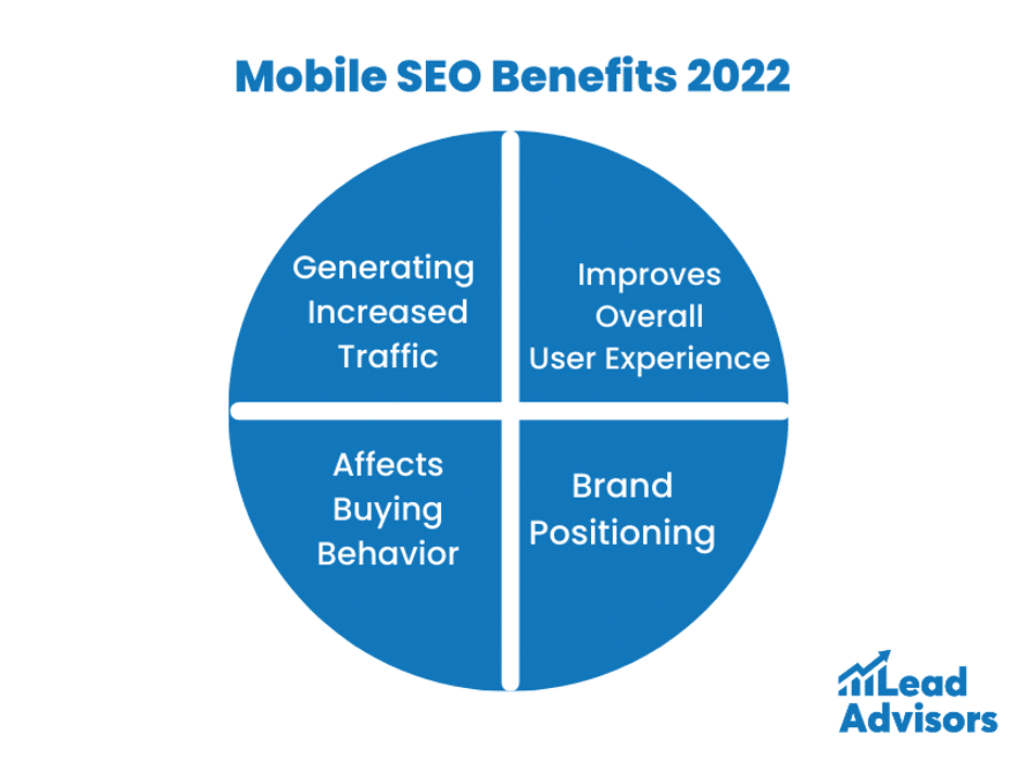
- Generating Increased Traffic
- More Conversions
- Affects Buying Behavior
- Brand Positioning
- Decreased Bounce Rate
- Improves Overall User Experience
- Increase in ROI
After considering all of these aspects and elements, it becomes clear that appearing in search results is the primary chance for potential customers to become aware of and evaluate your brand.
Therefore, we will thoroughly explore the essential components and recommended methods of an effective mobile SEO approach in 2022, including content, links, and technical website configuration.
For technical SEO solution, schedule a call now!
11 SEO Mobile Best Practices in 2022

As more and more people rely on their smartphones for browsing the internet, it’s crucial for businesses to optimize their websites for mobile devices.
Mobile search ranking factors are now a crucial part of SEO, and failing to keep up with them can lead to a decline in your search engine rankings. Here are the 12 best practices to optimize the mobile version of your site.
You May Also Like: Sponsored Content Marketing: Everything You Need to Know
1. Set your website configuration
Configure your website carefully to ensure it is optimized for mobile devices. With the introduction of Google’s mobile-first index in 2018, it has become essential for websites to be mobile-friendly.
The indexing uses information obtained from websites to understand their content and structure. To accommodate mobile users, website owners have used different configuration methods in the past.
- Separate sites – The oldest website configuration method involved creating two different versions. One was for PCs, while the other was for mobile phones. However, this took a lot of time and effort. It is why some companies still are not using newer methods.
- Dynamic serving – A website will have one URL to lead visitors to versions that match their devices. It meant creating a webpage for every model and screen size of a smartphone! As you can imagine, this also took too much time and effort.
- Responsive web design – This method involves a single URL that adapts to each visitor’s device. The owner doesn’t have to make multiple web pages; they load faster. More importantly, Google prefers this method over the others.
Plan your website carefully. Be sure about your website configuration. Otherwise, you’ll end up wasting time and money. As we said, it’s enough for companies to avoid the new methods.
You May Also Like: Website vs. Landing Page: Crucial Differences for Businesses
2. Check your web pages

Your website contains several web pages. Each page on your site plays a vital role in the user experience. That is why you must check them one by one.
Fortunately, you can do this without spending a dime. Google Search Console is a free service that contains all the needed tools. Here’s how you can use it to test web pages:
- Open the Google Search Console.
- Find the “Mobile Usability” button. A menu should appear. It will show the results that visitors get when they head to your website.
- Check the results for any issues. If there are any, the Console will show notifications and provide steps for fixing the problems.
An alternative option is to utilize the Google Mobile-Friendly Test Tool, which functions similarly to Google’s homepage. By entering your website’s URL into the search bar and clicking below, you can evaluate its mobile-friendliness.
You should manually visit the website yourself, using a device that is not affiliated with your company and does not link to your online tools, to obtain a more accurate representation of the user experience.
Utilizing a device with cookies or apps associated with the website may give you an unfair advantage and a biased perspective. It is advised to use multiple methods of evaluation to ensure a comprehensive analysis of your website’s mobile-friendliness.
3. Improve your website loading speed

Say you allow online purchases on your website. If it has long load times, your customers will likely leave you. They won’t hang around if they can get better service elsewhere!
Slow page speed or load times on your website can lead to customers leaving for better service elsewhere, affecting the lead generation and potential sales.
To avoid this, utilize Google’s free and simple mobile speed test to evaluate your website’s performance in mobile and desktop searches and receive solutions for improvement.
Additionally, regularly check your site speed using the PageSpeed Insights analyzer tool.
4. Ensure smooth website navigation

Perhaps, your website may load quickly, but have you noticed it looks off on certain devices?
This could be due to poor web optimization, resulting in misplaced content and frustrating user experiences.
Visitors may quickly leave your site, increasing your bounce rate. Luckily, the solution for mobile optimization is similar to desktop. Keep reading to find out how to fix it!
- Make user-friendly menus – Your menus should not appear on your homepage. Otherwise, they’ll take up substantial space on the page. Instead, it should show up as a pull-down menu or toggle.
- Adjust the screen size – Your website should adapt to each visitor’s screen size. Use responsive web design or dynamic serving.
- Offer easy search – Make it easy for users to access the search bar. Your search filters should lower the chances of producing zero results.
- Include widgets – If you’ve checked your competitors’ websites, you may have noticed a small button in the bottom right corner. These often lead you to a customer service representative or a chatbot. It’s a small detail that can make a huge difference in user experience.
If you want to develop a mobile app, schedule a free strategy call here.
5. Avoid cluttered designs

You’ve used the SEO mobile best practices so far. Your website has minimal load times, and it’s easy to use. Yet, you still have minimal site traffic. What could be the problem?
Your website shouldn’t just focus on functions. It must also be top-notch in its form. Improve it using these steps:
- Writing short paragraphs – Smartphones have limited screen space. You don’t want massive walls of text using up so much of it. Instead, divide them into smaller sections. This article applies this mobile SEO method!
- Using bullet points – Don’t use paragraphs for lists. Otherwise, readers will have to strain their eyes to read every sentence. Use bullet points instead.
- Choosing the right fonts – A fancy font style can make your website unique. However, readers might find it hard to read. Use simple ones like Arial instead. Use other ways to dazzle your audience.
- Picking the right colors – Your web pages shouldn’t be drab and dull. On the other hand, it shouldn’t hurt the eyes with too many colors. Use one color for the background and another for the text.
You May Also Like: Small Business SEO Guide for 2023
6. Improve your URL structure
Search engines crawl sites and follow links. Google crawlers land on a website and use links to find other content to analyze.
Search engines don’t like reading extensive strings of words with complex structures. Thus, if possible, shorten your URLs. Put them up to include as little beyond the main keyword for which you want to optimize the page as possible.
7. Fix dead links and broken redirects
A broken link is an internal link that sends a website visitor to a nonexistent page, such as a 404 error. Discontinued content, server technical SEO issues, or mistyped links result in many dead links on certain websites.
It is particularly striking when the links enclose in reused site layouts, like headers and footers. A dead redirect points to a resource that might no longer be there.
Both provide a poor user experience but, most importantly, prevent search engines from indexing your content.
8. Optimize your website for local SEO

Local SEO is crucial to your mobile strategy, as users often search for nearby businesses using phrases like “open now” or “near me.”
In fact, 46% of Google searches are for local businesses, and 72% of searchers visit a local shop within 24 hours of their search.
To increase your chances of appearing in local search results, include local keywords such as your zip code, city, landmark, school, or state.
Google also considers proximity to the user’s location when analyzing local websites, so it’s important to prioritize your local presence.
You May Also Like: Tips on Ranking Content For Google’s Top Search Results
9. Focus on voice search optimization

With smart devices and voice assistants becoming more popular, it’s important to optimize for voice search in your mobile SEO strategy.
Did you know that 41% of adults and 55% of teens use voice search daily? That’s a lot of potential customers!
By optimizing for voice search, your website can have a big advantage in 2022 and beyond. So, what is voice search optimization, and how can you improve your voice search rankings? Check out these tips to get started!
- Consider target keywords- To optimize for voice search, focus on using long-tail keywords and natural language phrases that people would typically use in real life. Optimize for core web vitals- These metrics are essential for voice search optimization, as slow and unresponsive websites can frustrate users and affect rankings.
- Employ mobile optimization– This is crucial for voice search optimization since 20% of mobile searches are voice searches. To optimize your website for mobile users, you can use responsive design, AMPs, or adaptive design to ensure that your website is optimized for different screen sizes and devices, providing a seamless user experience.
- Use structured data– Structured data is vital for voice search optimization as it helps search engines provide accurate and relevant answers to users’ questions.
10. Prioritize above-the-fold content
Did you know that mobile users have surpassed desktop users in recent years? That’s right!
According to Statista, mobile devices accounted for 61.6% of global internet usage in 2021 and this number is expected to rise to 72.9% by 2025. This means that more and more people are using their phones to search the web, including on search engines like Google.
That’s why it’s super important to optimize your Above-The-Fold content. This means making sure that the most important information is displayed prominently and easy to access.
Just take a look at successful companies like Amazon, Google, and Airbnb – they’ve all prioritized Above-The-Fold content and have seen awesome results like increased engagement, more traffic, and boosted revenue. So make sure you’re optimizing your content for mobile too!
11. Track your website’s performance

Optimizing your content is a never-ending process. It’s crucial to keep up with the internet’s constant changes. Tracking your efforts helps strengthen your strategy further.
Search engines are constantly updating—also, operating systems like Windows change. Web browsers and mobile devices do this too.
It means your website may not perform as well as it did before. It is why you must keep up with the latest tech updates. Then, redo the mobile SEO methods accordingly.
Monitoring your SEO performance means tracking data about website traffic, user engagement, and links. Here are the most common SEO key performance indicators (KPIs):
- Organic traffic growth
- Keyword research rankings
- Conversions from organic traffic
- Average session duration on page
- Bounce rate
- Top landing pages attracting organic traffic
- Number of indexed pages
- Cost per click
- Links growth (including new and lost links)
Read More: How to Generate Leads: Strategies and Best Practices
Final Thoughts
This article shows you the basics of mobile SEO. However, it would help if you learned more about using it for your business indeed. It means taking time to learn about structured data and user agents.
It might be much better to outsource the optimization instead. This way, you’ll get great results with less time and money.
Fortunately, we’re here to provide the SEO expertise you deserve. With LeadAdvisors, you can rest assured that your digital marketing is in capable hands.
Need more traffic? Build your brand authority with a free content strategy audit.
Updated- April 19, 2023
More people prefer to use mobile devices when browsing the internet. It is why you must create content suited for these gadgets. In turn, you’ll rank high on the search results. What’s more, you’ll be able to provide a better user experience and project a positive brand image.
How can I have better mobile SEO?
Your web pages should load correctly on any smartphone model or brand. They should not take too long to load and are hard to read. Still, you should follow desktop and SEO mobile best practices, such as internal linking. Follow Google search requirements when writing your meta descriptions, alt texts, anchor texts, and title tags.
These are online services that allow you to optimize content for search engines. Google provides a wide range of free SEO options. On the other hand, paying for different services like SEMRush tools is good. For best results, you should use free and paid options.


